
Explainer graphics are where I usually lose an afternoon and end up with something that looks like a slide from 2014.
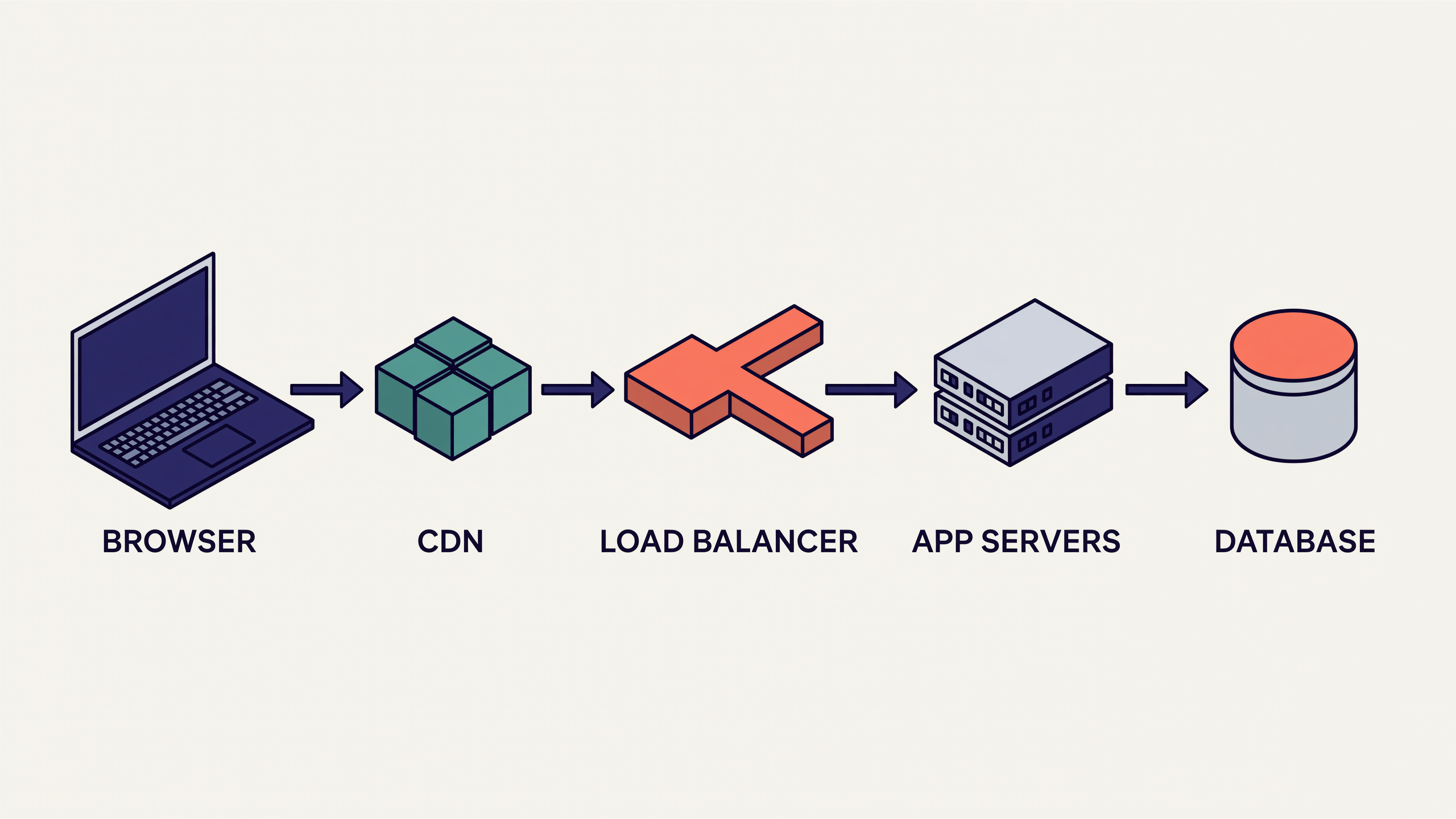
I gave Quodara a paragraph describing how a request travels from a browser through a CDN, a load balancer and an app server to a database, and asked for a clean isometric diagram — consistent 30-degree projection, a flat limited palette, labelled blocks, arrows showing direction of flow.
It came back with a single coherent scene rather than five pieces of clip-art in a row. Every element sits on the same isometric grid. The arrows read left to right without crossing. The labels are legible and spelled correctly. The palette holds to four colours, so nothing shouts.
I have since reused the exact prompt with different node names four times, and the whole set looks like it came out of one design system.
One paragraph in, one diagram out, roughly two minutes.
If you write documentation, decks or technical posts and you cannot draw, this is the highest-leverage prompt I have. It is below.